Pagepilot
Designed PagePilot’s guide module to improve user activation

Context
Pagepilot is a B2B product experience tool that helps teams add in-app guides, tooltips, and walkthroughs to improve product onboarding.
Skills
UX research, Product thinking, Interaction design, Information architecture, Prototyping, Iconography
Team
2 UX Designers,
4 Developers,
2 Stakeholders
Timeline
5 months
Problem
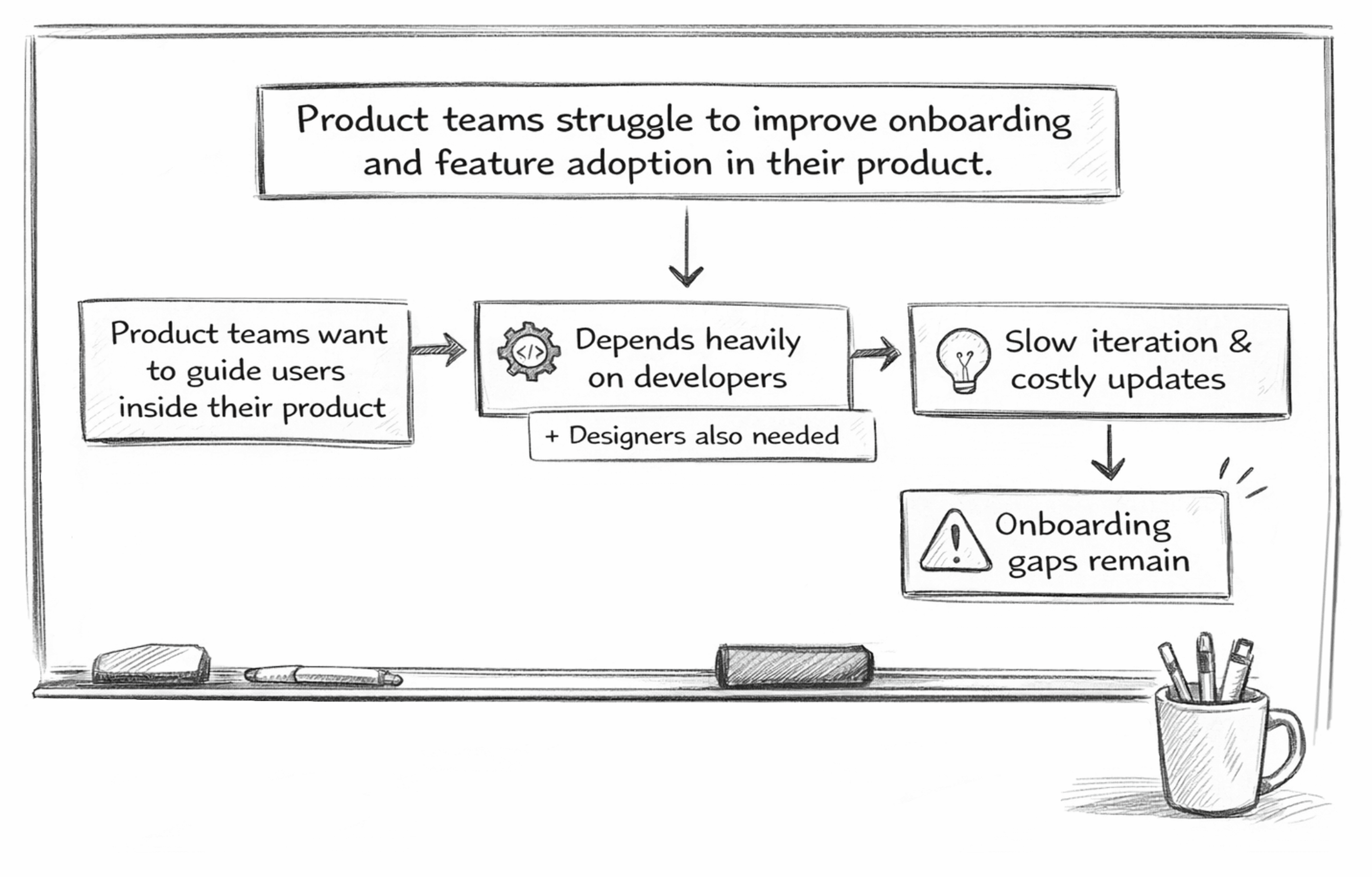
Existing Guide Editor

To understand the current experience, I first explored the existing guide editor developed by the team. It provided the core functionality for creating product guides, but several usability issues made the experience difficult for non-technical users. The interface had a high cognitive load, lacked a guided creation flow, exposed technical settings too early, and felt more like a rich text editor than a visual editor. These observations became the foundation for my design decisions.
Product Requirements
The editor must be simple and easy for non-technical users.
Reduce dependency on developers for onboarding updates.
Guides must support both tooltips and product tours.
The system must work across web and mobile products.
Teams needed reusable guide templates to create consistent onboarding patterns.
The guide editor needed to be reusable across other PagePilot modules.
Precise UI element inspection (DOM-level hover mapping) is not feasible due to multi-platform support.
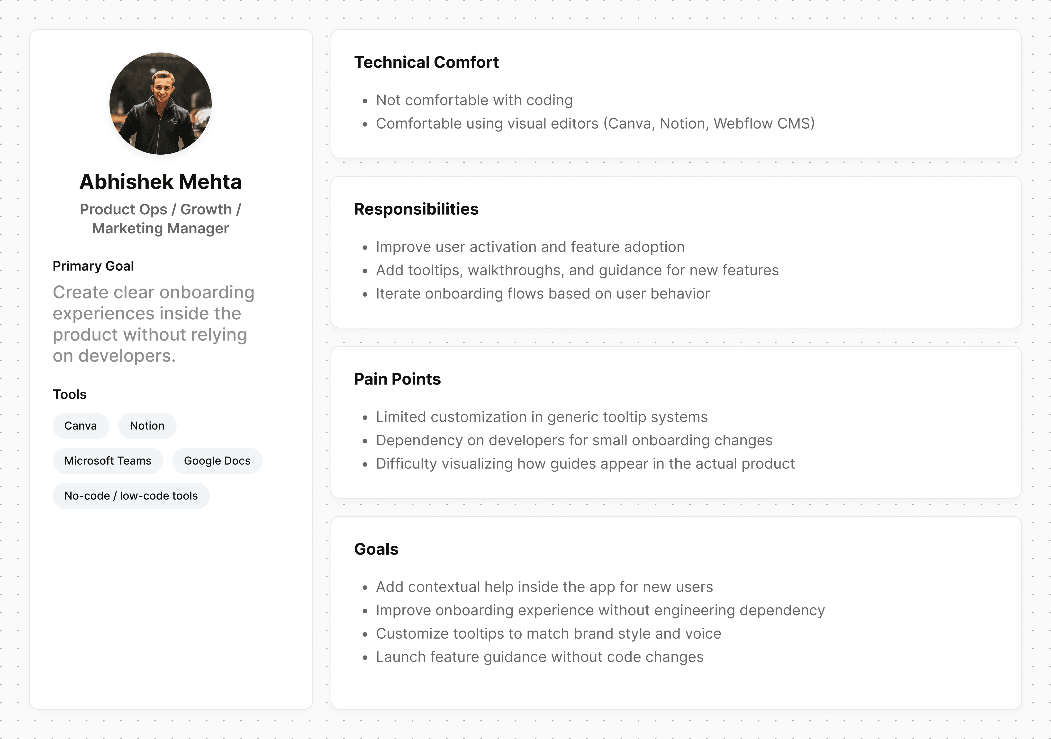
After defining the problem and understanding the Product requirements, it became clear that the success of this guide module depended heavily on who would actually use it.
I defined a primary user persona to represent these users,their pain points and their needs.
How might we make the guide creation experience feel visual and intuitive, rather than technical?
How might we support both simple tooltips and multi-step product tours without increasing complexity?
While these questions clarified the direction, I also wanted to understand how similar problems were being solved in the market. Exploring existing tools helped identify common patterns, gaps, and mistakes to avoid.
Market Exploration: How Existing Tools Enable In-App Guidance

Key Insights
Existing tools offer flexibility, but at the cost of usability for non-technical users.
Users frequently rely on tutorials or videos, increasing friction.
Multiple steps and configuration screens slow down simple use cases.
Users struggle to understand how guides will appear in their product while creating them.
Combining tooltips and product tours often overwhelms first-time users.
With these insights in mind, I began exploring possible solutions by mapping out different user flows and structuring the information architecture.

How might we design a reusable editor that stays consistent across different PagePilot modules?

To design a unified editor, I first analyzed how existing editors structure their content. Since the editor was built on a plugin with limited customization, I worked closely with developers to get what was technically possible and designed the system within those constraints.

Key Issues Identified During Wireframe Testing
Users struggled to understand the difference between tour and tooltip during creation.
Introducing multiple editor tabs early in the flow increased cognitive load.
Requiring product integration upfront negatively impacted the first-time experience because users wanted to explore and design tooltips first, and involve developers later when needed.

Comparing the existing editor with the redesigned visual editor after usability improvements.


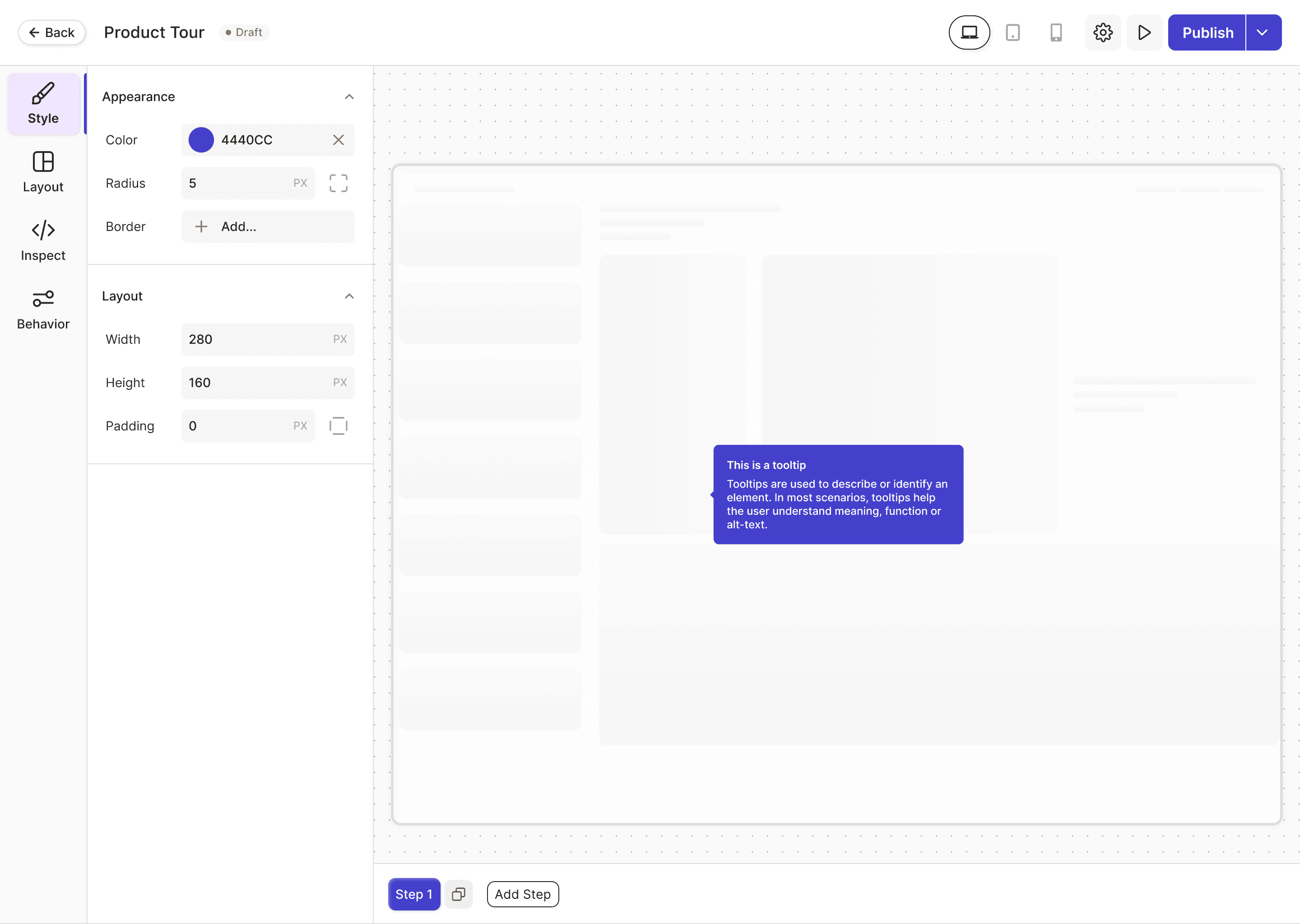


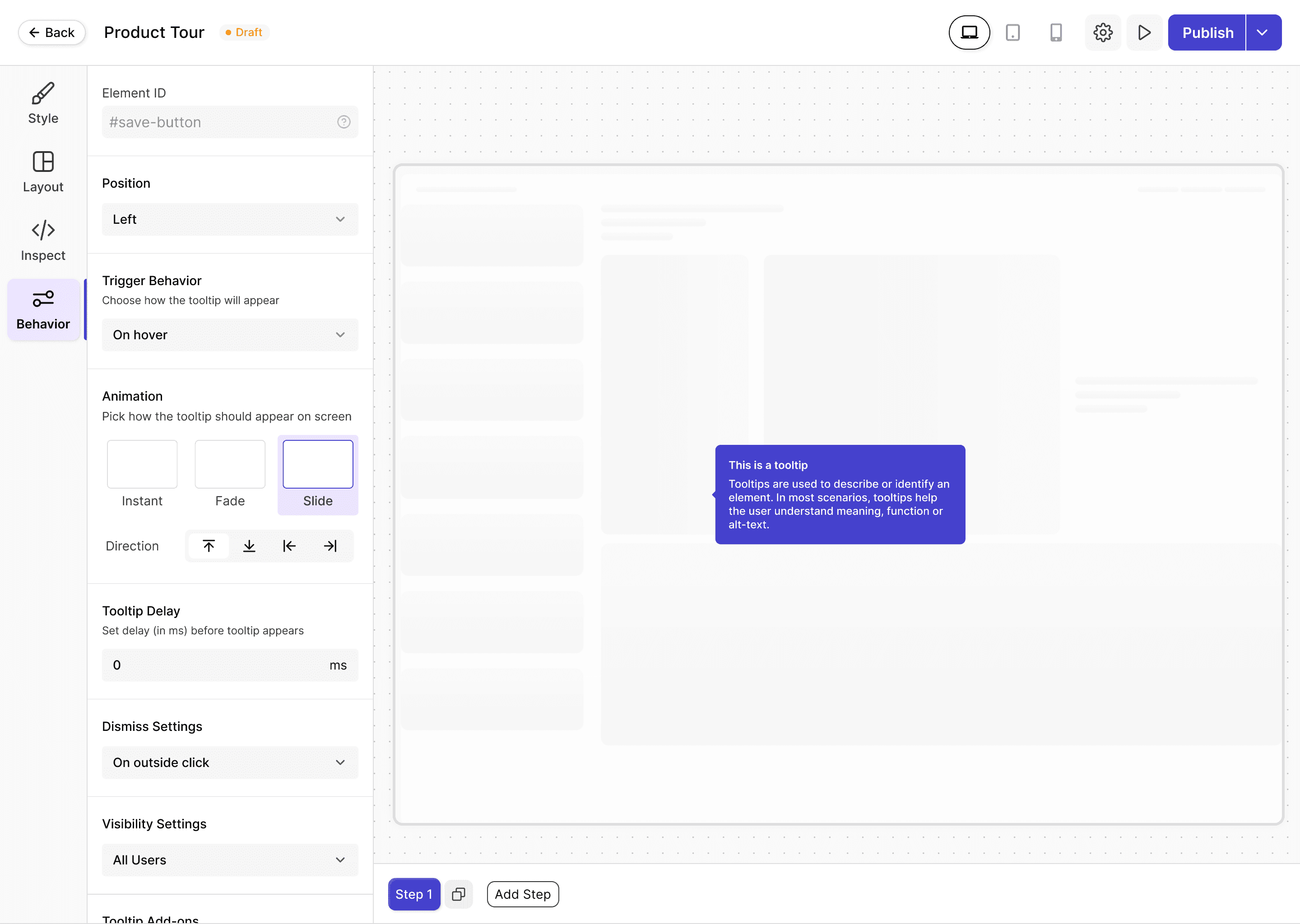
Simplified creation flow with guided, intuitive user interactions.
Visual interaction flow for multi-step product tours.



Results
80% Reduced User Confusion
Simplified navigation and progressive workflows.
40% Higher Task Completion
Guided interactions improved successful completion of setup tasks.
35% Faster Guide Creation
Reduced unnecessary steps.
Scalable Unified Editor
One editor architecture now supports multiple modules.
This project taught me that product design is much more than designing screens. It helped me think in systems, test ideas early with users, and improve them before investing too much time. One of my biggest learnings was that good design starts with asking the right questions. The better I understood the business goals, user needs, and technical limitations, the easier it became to make the right design decisions. It also showed me how important collaboration is in building products that are both useful and scalable.